Street SmARTS is a partnership between the San Francisco Arts Commission and the Public Works sector. Their mission is to pair local artists with private property owners who have received Notices of Violation for the removal of graffiti on their buildings. They aim to beautify the neighborhoods, support local artists to promote their businesses, and deter ongoing vandalism.
User Research | UX/UI | Mobile App | iOS | Prototyping | 2023
DESIGN iOS APP
My Role: in a small team of three with Allison Huston and Damian Guerra, I was the UX/UI Designer and Researcher. I also led the visual design phase of this project.
Tools: Paper Sketches, Figma
Project Timeline: May 2023 | 2-Week Design Sprint
Deliverables: User Research, Affinity Mapping, Journey Map, Feature Prioritization, Competitive Analysis, Wireframing, Prototyping, Hi-Fi Mockups, Usability Testing
THE GOAL
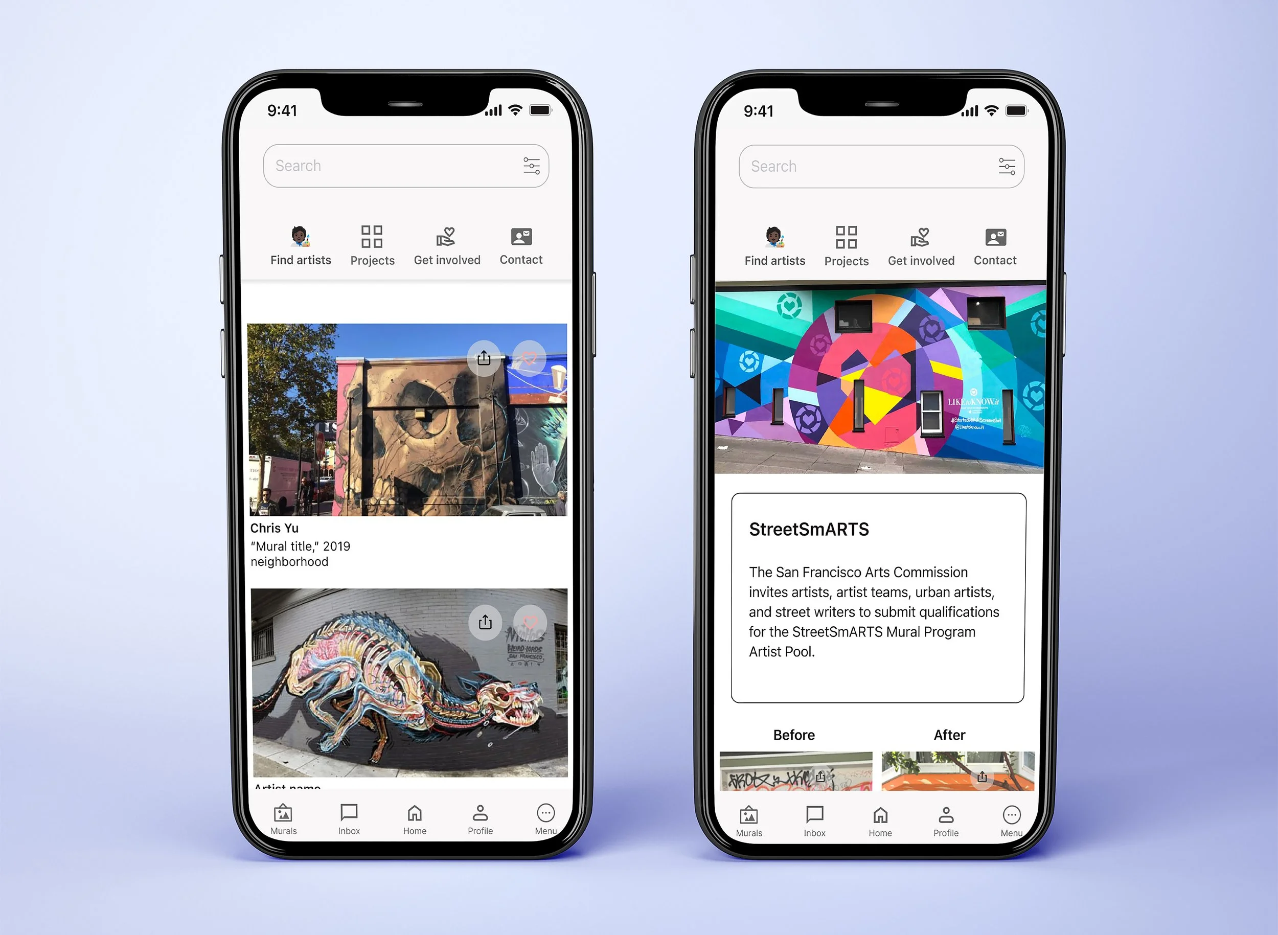
For this iOS app, our focus was to prioritize features and create a minimal and fresh design layout that highlights the images and murals provided by the artists while adhering to the iOS style guide.
THE PROBLEM
StreetSmARTS wants to expand its reach to more artists through the iOS app, and facilitate direct connections between local artists and property owners while ensuring that the artists will get reliable commissions and get paid for their work.
THE SOLUTION
With the launch of its new iOS app, StreetSmARTS will be able to connect property owners with vetted artists to help cover up graffiti on their property while preserving artists' freedom of choice and financial security.
For this project, I conducted four artist interviews, created a journey map for the artist persona, and prioritized features. I also collaborated on affinity mapping, user flows, and competitive analysis. I took the lead in the visual design phase, and I initiated the process with ideation and sketching (Low-Fidelity sketches- drawings/wireframes). We then moved to Mid-Fidelity wireframing, prototyping, conducting usability testing, and then creating high-fidelity mockups.
THE PROCESS
We embarked on the design process by conducting a competitive analysis to gain deeper insights into three art organizations that connect artists with commissioners to understand how these organizations initiate the process and operate. I explored two organizations Boston Art Inc and Paint the Void.
Competitive Analysis
We studied three art organizations that link artists with clients to understand how these organizations work. I looked into Boston Art Inc. and Paint the Void.
Boston Art Inc.
Overview: Boston Art Inc. serves as an art commissioner and consultant operating in the Greater Boston Area.
Partnerships: The organization has established partnerships with companies across various industries, tailoring their approach to artists based on the specific needs of these companies' artworks and budgets.
Operational Process: Boston Art Inc. boasts a well-defined and detailed step-by-step process, ensuring transparency and efficiency in its operations.
Paint the Void
Overview: Paint the Void operates as a non-profit organization in the San Francisco Bay Area.
Mural Discovery: The organization offers a unique service by providing a map to help individuals discover and locate murals within the city.
Community Engagement: Paint the Void encourages community involvement by providing a Mural Map and clear steps for both business owners and artists who want to engage with and contribute to the vibrant mural scene.
In my role, I took on the responsibility of identifying the primary features of the app. To gather more information about the crucial elements of the app's primary navigation, I employed the MoSCoW method.
From there, I conducted four user interviews with artists, while Allison and Damian each conducted one user interview with property owners.
User Interviews Insights
Through conversations with artists, I identified significant challenges in the commissioning process. Sensitivity around payments, particularly delays, emerged as a significant concern. Artists expressed doubts about the reliability of commissioners, and challenges working within imposed constraints were highlighted. The absence of a clear point of contact was a common frustration. These insights underscore the importance of addressing payment timeliness, building trust, accommodating constraints, and providing effective communication channels in the platform design.
We utilized the insights gathered from these interviews to create an affinity map, and Allison and Damian were responsible for developing the two personas.
View Affinity Map
Journey Map
Our team aimed to understand the perspectives of both artists and property owners, addressing their frustrations through our designs. To achieve this, we focused on gaining a deeper understanding of their emotional journey.
Gloria was our artist persona. Our app was not launched yet so I began the journey by identifying Gloria's frustrations and scenarios using her past experiences.
View User Journey
User Journeys allows us to align our design with the needs of both artists and property owners.
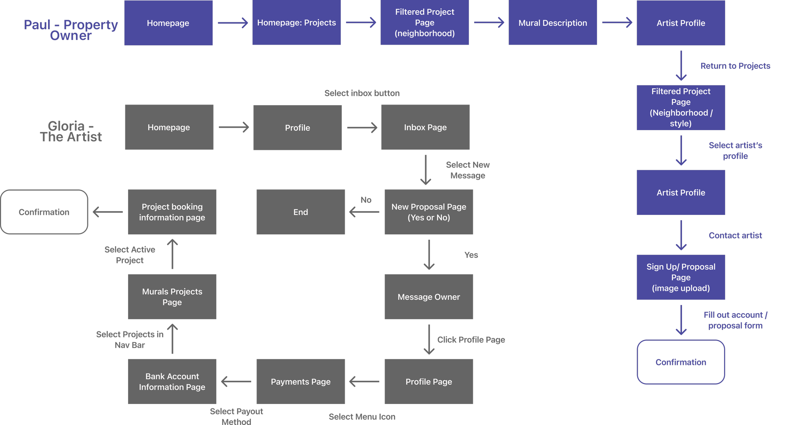
Using feedback from our users, we came up with an ideal user flow to gain insights on what types of pages were needed. See the two task flows here.
View Task Flow
Sketching
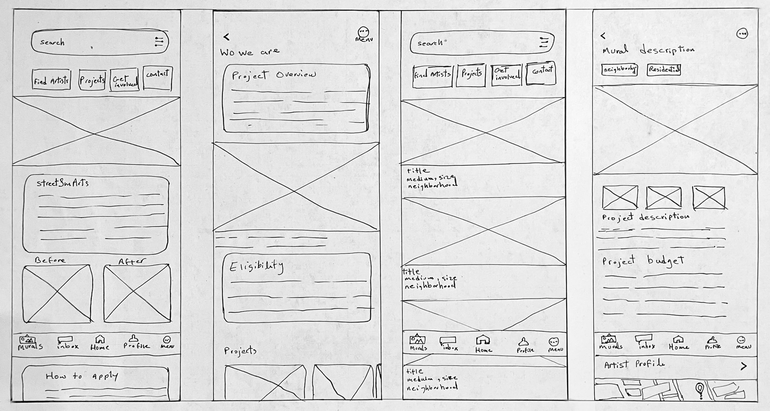
I sketched initial ideas and collaborated with my team to gather feedback and iterate on the designs. The visual approach aimed for a minimal and fresh design layout, with the main focus being on showcasing the artists' work effectively to enhance their self-promotion within the app.
I transformed my sketches into digital wireframes.


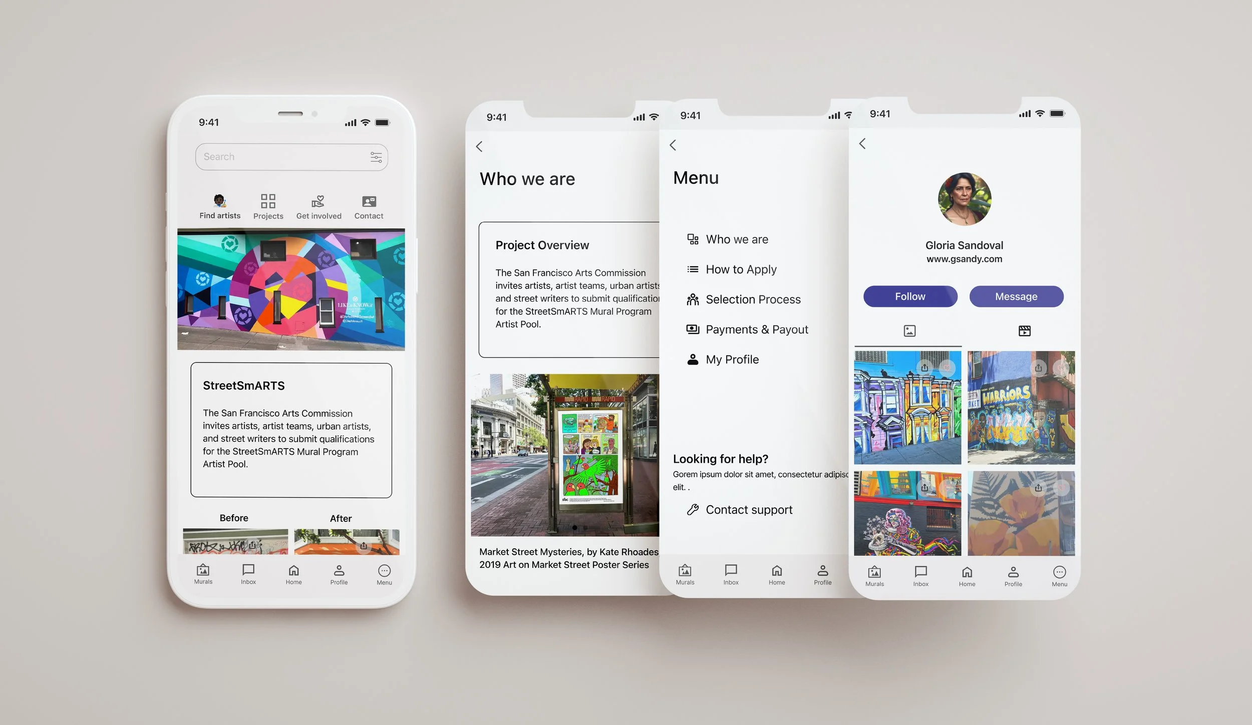
Following the usability testing conducted by my team, we transitioned to designing high-fidelity screens.
View High Fidelity Wireframes
I LEARNED
I learned the importance of adapting work methods within the group for efficiency. Neglecting this led to frustration and inefficiency. Giving each other room to complete tasks led to excellent outcomes. Being part of a team motivated me to deliver higher-quality work, knowing others relied on it.
NEXT STEPS
The menu button is unclear; darken it for visibility or switch to the classic hamburger-style
Revise the search and filter layout to separate the filter feature from the search bar, reducing confusion
Continue exploring options to connect artists with projects for collaboration opportunities
